Key Takeaways
| Aspect | Details |
|---|---|
| Understanding Retro Colors | Retro colors are bold yet earthy and are inspired by styles from the ’50s to ’90s. Colors like mustard, teal, pinks, and neon shades dominate. |
| Choosing the Right Shades | Balancing neutral and bold colors and incorporating complementary schemes helps maintain visual harmony. |
| Trends in 2024 | Pastels and muted tones are back in style, often combined with patterns like geometric shapes and stripes. |
| Application Areas | These colors can enhance fashion, home décor, graphic designs, and web design aesthetics. |
Why Retro Colors Stand Out
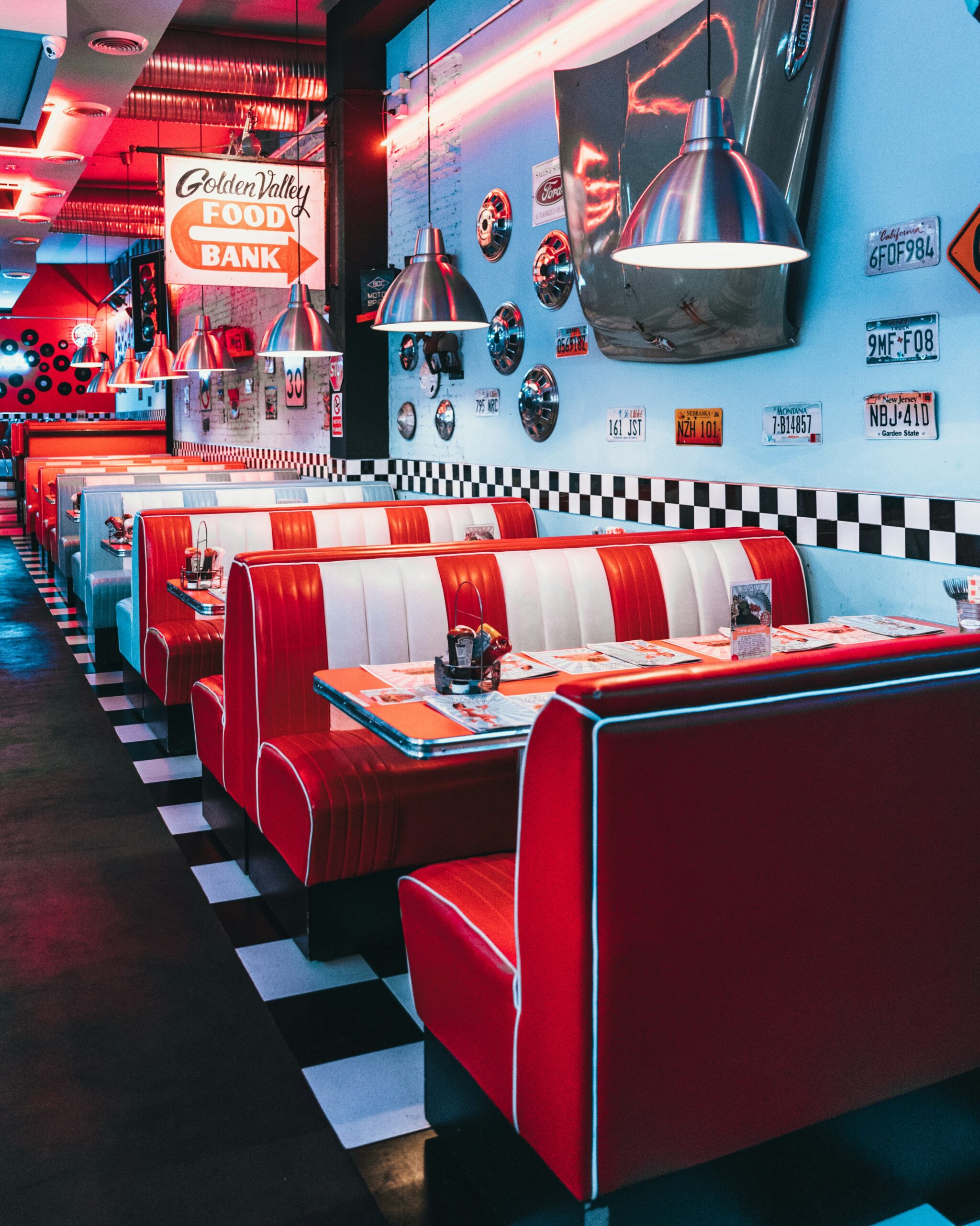
Retro colors resonate because they carry both aesthetic charm and nostalgic value. Bold shades of mustard yellow, teal, and deep maroon from the ’60s are timeless, while neon shades of green and pink evoke the vibrant ’80s and ’90s.
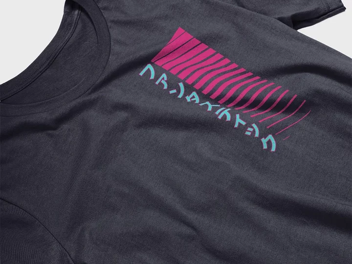
Choosing the perfect retro palette for your project depends on your theme and the type of vibe you wish to create. To learn more about why minimalist but bold choices remain timeless, explore the Computer Japanese Katakana collection.
Choosing the Right Shades
When planning a retro-inspired project:
- Balance is Key:
- Match bold retro shades like reds or neon greens with subtler neutrals like creams or beige.
- Overwhelming vibrant tones should be used sparingly for pop!
- Explore Patterns:
- Geometric or floral patterns inspired by the 1960–1980 era create balance. Perfect for setting vintage themes in clothing or retro modern interiors.
For examples combining colors dynamically with modern icons, don’t miss the beautifully patterned Retrowave Alien Sun t-shirt line.
Using Patterns and Contrasts
Another way to achieve retro distinction is to leverage dual shades. Use semi-subtle yellows alongside gradients of white or cream to create a balanced yet vibrant look. Incorporate pastel shades, like burnt pink or bright, gentle tones, to achieve a chromatic blend that evokes a true retro feel.
Key Takeaways
| Aspect | Details |
|---|---|
| Understanding Retro Colors | Retro colors include earthy tones, bold shades, pastels, and neons from the ’50s to ’90s, each evoking nostalgia. |
| Choosing the Right Shades | Balance bold and neutral shades, use complementary schemes, and avoid overusing loud colors. |
| Trends in 2024 | Pastels like baby blue, blush pink, and mint green dominate, paired with geometric or stripe patterns. |
| Application Areas | Perfect for fashion, home décor, and graphic designs, retro colors enhance personality and vibrance. |
Understanding Retro Colors
Retro-inspired color palettes evoke the essence of different decades, with mustard yellows and teals characterizing the ’60s, bright neons from the ’80s, and soft pastels from the ’50s. Whether you’re designing a website or a graphic tee, blending bold colors and muted tones can achieve a timeless retro feel.
If you’re seeking inspiration that captures this vibe, the Fantastic in Japanese Katakana collection offers designs full of nostalgic tones.
Key Retro Trends
In 2024, subtlety meets vibrance in the resurgence of retro trends. Look out for:
- Soft Pastels like baby blue and dusty pink, used alongside geometric patterns.
- Earthy Tones inspired by the ’70s, such as olive green and terracotta.
- Dynamic Pairings of dark and light shades, creating striking visual contrast.
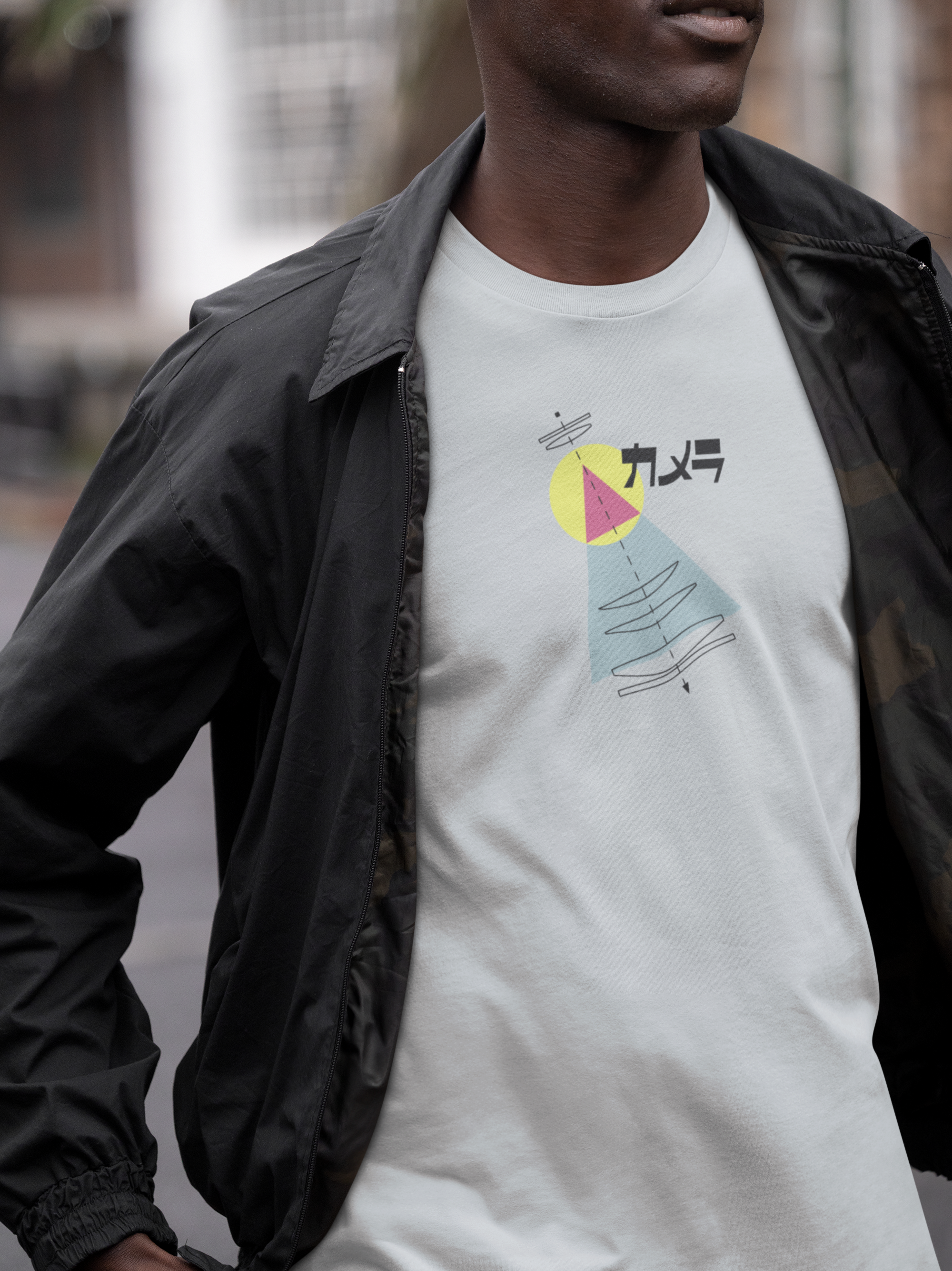
One trendsetting design that balances nostalgia and modern aesthetics is the Camera Japanese Katakana line, embodying clean contrasts and iconic hues.
Incorporating Retro Vibes in Fashion
Fashion thrives on evoking eras. By integrating dynamic retro palettes, designs can connect with audiences who cherish their nostalgic charm. Examples include pairing a blush pink backdrop with detailed geometric embellishments for a modern yet retro design.
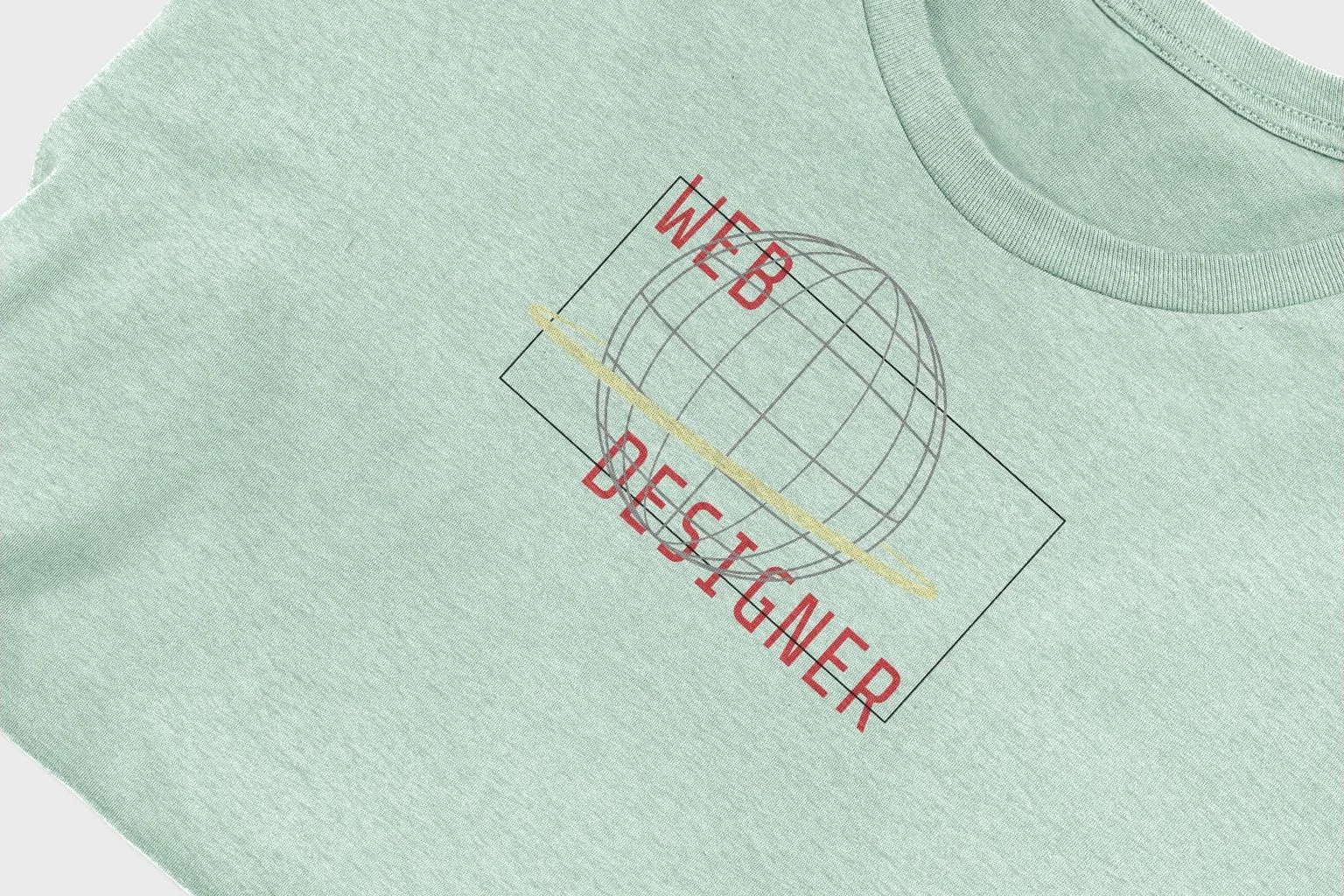
For apparel showcasing nostalgic undertones with modern execution, explore the Web Designer Internet Globe. The product blends earthy tones and minimalist graphics.
The Psychology of Retro Colors
Retro colors are more than just visually striking—they evoke emotions tied to memories of past decades. Here’s how different shades create specific feelings:
- Mustard Yellow and Burnt Orange: Warmth, energy, and a comforting nod to the ’70s.
- Teal and Seafoam Green: Cool sophistication, channeling mid-century modern vibes.
- Pastel Pink and Baby Blue: Innocence and nostalgia, reminiscent of the 1950s soda shops.
- Neon Pink and Lime Green: A vibrant, rebellious feel that recalls the boldness of ’80s pop culture.
Want to see these retro tones in action? The Retrowave Alien Sun combines neon palettes to perfect that classic ’80s sci-fi feel.
Mixing and Matching Retro Color Schemes
To achieve a cohesive retro aesthetic, it’s essential to mix and match color schemes effectively:
- Use Color Triads: Choose three colors evenly spaced on the color wheel, like red, teal, and mustard, to create a balanced yet dynamic palette.
- Focus on Dominance: Let one or two shades dominate while others serve as accents to enhance the design’s harmony.
For apparel or digital design inspiration, the Fantastic in Japanese Katakana line showcases excellent use of dominant colors and accents in retro fashion.
Applying Retro Colors Beyond Design
Retro colors aren’t limited to clothing—they can enhance various design fields:
- Interior Design
Combine patterned wallpaper in teal and mustard with earthy furniture for a mid-century-modern vibe. - Graphic Design
Pair retro fonts with bold colors for striking posters or brand imagery. - Web Design
Utilize pastel backgrounds with vibrant buttons or headers to craft a nostalgic, user-friendly experience.
Discover how simplicity with an edge works in web designs with the Web Designer Internet Globe collection, a clear nod to the retro-futuristic aesthetic.
Making Retro Colors Relevant Today
To stay relevant, combine retro colors with contemporary minimalism. Emphasize:
- Clean, uncluttered designs where retro tones pop.
- Sustainable materials for a retro-modern ethical aesthetic.
Practical Tips for Using Retro Colors
Incorporating retro colors effectively requires a thoughtful approach. Below are tips to ensure your designs resonate with authenticity while maintaining a modern appeal:
- Stay Decade-Specific
Each retro era is defined by its unique palette. For example:- The ’50s: Pastel tones (blush pink, mint green).
- The ’70s: Earthy hues (mustard yellow, burnt orange).
- The ’80s: Neon brights (electric pink, lime green).
- Add Texture
Retro designs often include visual textures like grainy patterns, gradients, or faded looks. These elements enhance the vintage feel without overwhelming the color palette. - Test in Context
Always test how colors work together in your actual application, whether on fabric, a screen, or walls. Different mediums reflect light uniquely, which can alter the perception of color.
For a masterclass in balancing nostalgic tones across product lines, check out Retrowave Alien Sun for its seamless integration of retro sci-fi vibes into apparel.
Pairing Retro Colors with Patterns
Patterns play a pivotal role in retro design. Consider these iconic patterns to pair with retro colors:
| Pattern Type | Suitable Colors | Era of Popularity |
|---|---|---|
| Polka Dots | Pastel yellows and soft pinks | 1950s |
| Bold Geometrics | Neon pinks and teals | 1980s |
| Stripes and Plaids | Earthy greens and rich browns | 1970s |
Applying these patterns can amplify the retro vibe while lending visual complexity. For a fusion of Japanese aesthetics with retro simplicity, explore the Camera Japanese Katakana collection.
Closing Thoughts
Retro colors hold a timeless allure, offering design versatility across fashion, interiors, and digital applications. By studying the essence of different eras and carefully selecting complementary hues, you can master the art of creating retro-inspired visuals that connect with audiences on an emotional and aesthetic level.
Comments
One response to “Choosing Colors for a Retro Vibe”
[…] Visual Cues: Your reaction to colors matters. We’ll present scenarios involving retro color palettes, from soft pastels to high-contrast neons on black […]