
In 2026, it helps to remember how rare traction is in pixel art, because 7.5% of 2D pixel art game titles released in or after 2023 (0-6 months) reached a milestone of selling over 10,000 copies. That same reality applies to pixel art placement on a t-shirt, because where your art sits often decides whether people instantly “get it” or scroll past.
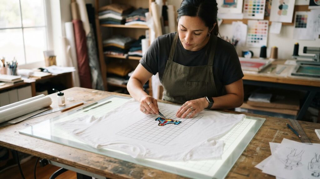
Key Takeaways
| Quick read | What to do |
| Placement changes readability | Pick locations that stay clear when the shirt folds, stretches, or wrinkles. |
| Balance matters | Match your pixel art placement to your shirt type, neckline, and walking view (front, side, and back). |
| Use category context | If you’re going for arcade, retro, or travel vibes, placement should support the theme, not fight it. Start with our Retro and Video Games collections. |
| Try sleeve placements | Small pixel characters or icons work well on sleeves for “turn it around” style reveals. |
| Keep pixel edges sharp | Avoid placing ultra-fine details on areas that bend a lot. |
| Match art scale to viewing distance | Bigger blocks read better from a few steps away, while denser pixel work can go smaller and farther from creases. |
Common questions (short answers):
- What is pixel art placement? It is the exact location and sizing of your pixel artwork on a t-shirt so the design stays readable and looks intentional in everyday movement.
- Where should pixel art go on a t-shirt in 2026? Front chest and back center are the safest for readability, while sleeves are great for smaller “hidden” details.
- Does placement matter more than the design? Not more than the design, but placement can make or break legibility, especially for pixelated edges.
- Should we place pixel art on the shoulders? Usually, only if your art is bold and you avoid placing tiny pixel details directly over high-bend seams.
Front vs Back: the core pixel art placement zones
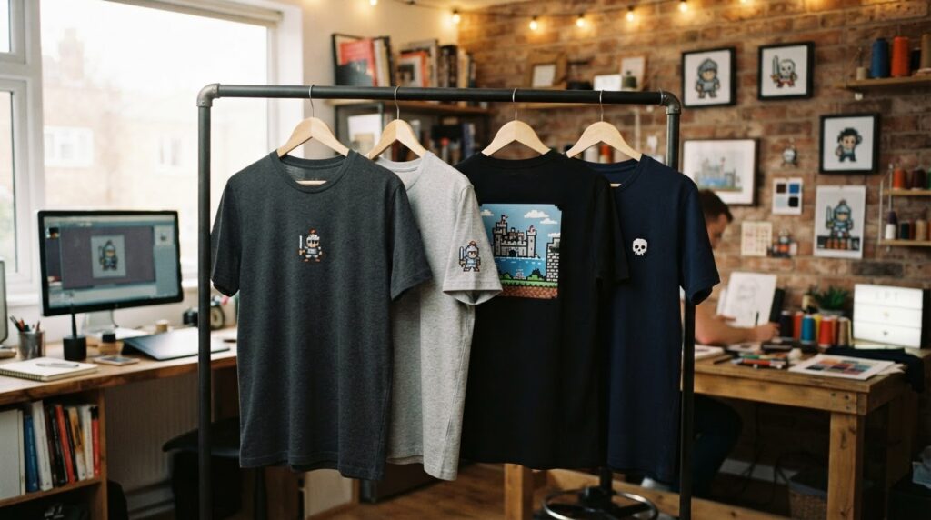
When we talk about pixel art placement, the first decision is “where will people see it most,” because t-shirts get worn in motion. Front chest placements usually hit first, back center placements usually leave the strongest second impression, and side placements create surprise when someone turns.
Front chest is best for designs that need instant recognition. For pixel art, we like larger, clearer silhouettes that survive wrinkles around the torso.
- Best use: characters, emblems, “boss” faces, or game-style logos with big pixel blocks.
- Avoid: super-thin outlines that get distorted by folds.
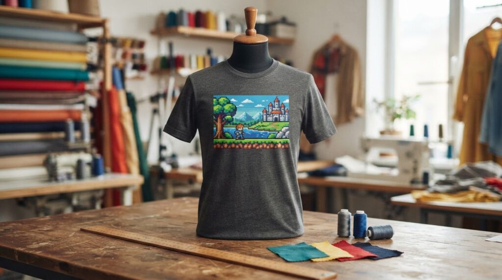
Back center is our go-to for story-driven pieces. It has room for bigger compositions like pixel landscapes, pixel party scenes, or retro taglines paired with a character.
- Best use: full-scene pixel art that looks good at a distance.
- Mind the fit: taller art can compress near the lower back depending on the shirt cut.
Upper back (near the yoke) can look awesome for pixel art placement, but the shoulder area creases more. If we use this zone, we keep pixel elements chunkier and keep text minimal.
Sleeves and side seams: the “turn it around” pixel art placement
In 2026, we keep seeing the same pattern with pixel art placement, people love details that show up at the right moment. Sleeves are perfect for that because they reveal during walking, waving, or reaching.
Sleeve placements work best when the pixel art is small and reads even when slightly curved. Think single icons, mini characters, or a short pixel banner.
- Left sleeve often feels clean for a character cameo.
- Right sleeve can host a mini badge, pixel text, or a “level up” style mark.
- Both sleeves can balance the look if the front is minimal.
Side seam placements are trickier, but they create a layered “story.” If we go this route, we keep the design oriented so it still looks intentional when the shirt stretches around the hips.
Rule we use: if the design depends on perfect straight lines, avoid placing it where fabric curves hard.
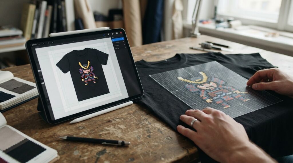
Pixel art placement for different art vibes (retro, Japanese aesthetic, travel)
Pixel art placement should match the vibe, not just the technique. The way people read “retro” versus “travel” designs is different, and placement helps you steer that interpretation instantly.
For retro looks, front chest placement with a bold emblem tends to work. For longer scenes, back center wins.
For Japanese aesthetic themed pieces, we often prefer clean spacing and fewer competing elements. That usually means smaller blocks on sleeves or a single strong element on the front.
For travel t-shirts, pixel art placement can frame a destination like a stamp. Front chest works for “logo + landmark,” while back center works for “full pixel postcard” style scenes.
- Explore our Japanese Aesthetic collection for layout ideas.
- Explore our Travel T-shirts collection for placement styles that feel like wearable souvenirs.
How big should your pixel art placement be? (scale, distance, and readability)
Pixel art placement is not only about position, it’s also about scale. In 2026, we treat pixel work like signage, from a few steps away you want the main shapes to pop immediately.
Use a two-layer approach: a “read from far” layer and a “notice up close” layer. That lets you keep your best pixels for the areas that flex less.
- Far reading: bigger blocks, fewer micro-details, bold contrast.
- Close reading: smaller pixel textures placed where fabric creases less.
Where size changes how it looks: the front chest can handle medium-to-large art, while the shoulders and upper back can compress the look if the height gets too aggressive. For sleeves, keep it small and iconic.
If your design includes pixel text, placement becomes even more important. Text over curved areas tends to look uneven, so we keep pixel fonts on the front or back center when possible.
Material fit and fabric bending: placement rules we follow in 2026
We’ve learned that pixel art placement behaves differently depending on the garment fit. Stretch, thickness, and where the shirt naturally wrinkles all change how pixel edges land visually.
Placement rule #1: avoid putting the thinnest pixel lines directly across high-bend zones. Those are the areas that will stretch, fold, or wrinkle every day.
Placement rule #2: for fitted cuts, the lower back and side areas bend more. If we want the pixel art to stay crisp, we keep dense details away from those bends.
Placement rule #3: if your art includes gradients or subtle shading, place it where the fabric stays flatter. Pixel shading on a very curved area can look blotchy.
In practice, our safest pixel art placement zones for crisp readability are front chest and back center, especially for designs with text or fine outlines.
Pixel art placement ideas for arcade, games, synthwave, and vaporwave
Different retro sub-styles usually want different placement energy. Arcade and game themes often feel like badges or character reveals, synthwave often benefits from centered compositions, and vaporwave tends to look great when you treat the shirt like a poster.
If you want game-style impact, think front chest for quick recognition and back center for bigger scenes. For synthwave, a centered back design can act like a “horizon line,” and sleeves work well for small icon accents.
- Check out Video Games for placement that feels like game UI or character branding.
- Check out Synthwave for neon-poster style layout thinking.
- Check out Vaporwave Aesthetics when you want pixel art placement to feel like stylized print media.
Putting it all together: a simple pixel art placement checklist
If you want pixel art placement that looks intentional in real life, we recommend using a quick checklist before finalizing your print layout. It keeps decisions practical, not theoretical.
- Choose the main viewing moment: front chest for instant reading, back center for the full scene.
- Match pixel density to the bend level: dense micro-details go on flatter areas.
- Keep text stable: put pixel text where fabric wrinkles less.
- Use sleeves for “extra”: icons, mini characters, or short pixel banners.
- Scale for distance: prioritize bold blocks so the art reads from a few steps away.
- Test in movement: check how the placement looks when walking, sitting, and reaching.
And if you’re building a theme collection, we like consistency. For example, you can keep the same pixel art placement rule across designs so every shirt looks like part of the same universe.
Conclusion
Pixel art placement is the difference between “cool art” and “instantly readable wearable art,” especially in 2026 when people see hundreds of designs and decide fast. When we choose front chest and back center for the main pixel composition, use sleeves for smaller reveals, and keep fine pixel details away from heavy creases, the result looks sharper and feels more intentional.
If you want inspiration aligned with your vibe, we’d start with our Retro, Video Games, and Travel T-shirts collections, then apply the checklist above to dial in your pixel art placement.
Frequently Asked Questions
Where should pixel art placement be on a t-shirt for the best visibility?
For most designs, pixel art placement works best on the front chest or the back center, because those areas stay readable when you move. Sleeves are great for small accents, but keep tiny details off high-crease spots so the pixels do not look distorted.
Is pixel art placement on the shoulders a bad idea in 2026?
It is not automatically a bad idea, but shoulders bend more, so pixel art placement there needs thicker lines and simpler shapes. If your design includes pixel text or fine shading, we recommend shifting it to the front chest or upper back instead.
How do we choose the right pixel art placement size for pixelated designs?
We size designs for distance first, then add detail for close-up viewing. If the art needs micro pixels to make sense, pixel art placement should be on flatter zones, while the main shapes should still read from a few steps away.
Should pixel art placement match the shirt cut (regular vs fitted)?
Yes, because fit changes wrinkle patterns and how fabric stretches. In 2026, we treat pixel art placement as a fit-specific decision, keeping dense details away from the bends that show up more in fitted cuts.
What are good pixel art placement ideas for game-themed t-shirts?
Game-themed pixel art placement usually performs well with character or emblem graphics on the front chest, and full scene artwork on the back center. Sleeves are ideal for mini “UI” icons or level-style marks that reveal when you move.
Can pixel art placement make cheap designs look more premium?
It can, because the biggest visual difference often comes from legibility and spacing. Even a simple pixel art layout looks more premium when the pixel art placement avoids creases, uses readable scale, and keeps high-contrast elements in stable zones.
Leave a Reply