
Did you know that “8-bit instruments” are associated with only 256 grey levels, compared with 4096 for Landsat 8, which is a great way to understand why 8-bit colorways feel so bold and intentional? In 2026, we keep seeing more people ask for pixel art t-shirts that look clean, nostalgic, and instantly readable, and the color palette is usually the difference between “cool” and “looks right.”
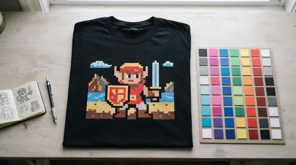
Key Takeaways
| What you’re choosing | Why it matters for 8-bit colorways |
|---|---|
| Limited palette (bit-depth mindset) | Keeps pixel edges crisp and makes the design read fast. |
| Value range (lights, mids, darks) | Lets shading work even with fewer colors. |
| Color limits per area | Prevents the “muddy pixels” look on fabric. |
| Contrast and outline strategy | Helps your 8-bit colorways pop from a distance. |
| Pick-tested colorways | In 2026 we see better results when you match tees to the art, not just the trend. |
| Good examples to start from | Check our 8-bit pixelated retro t-shirt and use it as a palette reference. |
- Short answer: the best 8-bit colorways use fewer colors, stronger contrast, and value-focused shading.
- We recommend: plan the palette before you worry about “perfect” hues.
- Common win: 1-2 highlight colors plus neutrals usually look more “authentic” than random rainbow gradients.
- If you want an easy reference: use our 8-bit pixelated retro t-shirt as a starting point.
- FAQ quickies in plain English: “Should I use fewer colors?” yes, and “How do I keep it readable?” rely on contrast and outlines.
What “8-bit colorways” really mean (and why limited palettes look better)
When people say 8-bit colorways, they usually mean color palettes that behave like classic pixel art: limited hues, clear value steps (lights to darks), and shading that reads at small sizes. The big reason it works is that a limited set of color levels forces decisions, so each pixel has a job.
There’s also a very practical fabric angle. On a t-shirt, ink behavior and viewing distance can flatten subtle gradients, so palettes that are built around strong values tend to hold up better. That is why 8-bit style art feels “clean,” even when it’s colorful.
In 2026, we keep noticing the same pattern: people want nostalgia, but they also want the design to look sharp in photos, in motion, and after a few washes. Your palette is the tool that makes that happen.
Start with value, not just color (lights, mids, and darks)
If you only pick colors you “like,” your 8-bit colorways can still look flat. Instead, we recommend you plan values first. Think of your palette in three layers: highlights, midtones, and shadows. Once those roles are set, hue choice becomes much easier.
Here’s a simple way to build a value-driven palette:
- Highlights: choose 1 main light tone (and maybe 1 extra for pops).
- Midtones: pick 2 to 4 mid colors that support the shape.
- Shadows: use 2 to 3 darker tones, ideally grouped so shadows feel consistent.
- Outlines or separators: decide if you want black, dark gray, or a dark accent line.
That “value first” approach is what keeps pixel shading believable. Even when you have fewer colors, your design still feels dimensional, which is basically the whole point of classic pixel art.
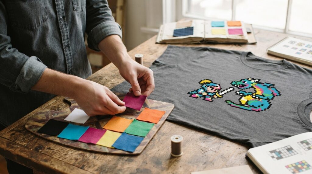
Pick a palette strategy for different art styles (retro, sci-fi, and “clean cute”)
Not every pixel art design should use the exact same 8-bit colorways approach. In 2026, we see three common styles that each benefit from a slightly different palette strategy.
Classic retro: warm highlights, muted mids, darker outlines. Keep the palette tight so it feels “console-era.”
Sci-fi and alien vibes: use cool shadow tones (teal, deep blue, purple) and a small set of neon-like highlights for energy.
Clean cute characters: prioritize readability. Use fewer background colors, stronger outlines, and controlled saturation so the character stays the hero.
A good rule: if your background is busy, your colorways must be stricter. If the background is simple, you can afford slightly more variation in the subject. Either way, fewer colors work best when your values stay consistent.
How to test 8-bit colorways so they look right on a t-shirt
Even a perfect digital palette can disappoint on fabric. So we treat palette testing like a production step, not an afterthought. The best 8-bit colorways are the ones that survive real lighting and real viewing distance.
Here’s what we test for:
- Distance readability: does the subject still pop at arm’s length?
- Contrast under daylight: bright sun can wash out midtones, so we look for clear light-to-dark separation.
- Contrast under indoor lighting: check that shadows do not turn into the same flat tone.
- Background noise: avoid extra colors in places that should be simple shapes.
If you want a straightforward reference, start from our existing pixel style work, then adjust your palette roles (highlights, mids, shadows) until the design reads instantly.
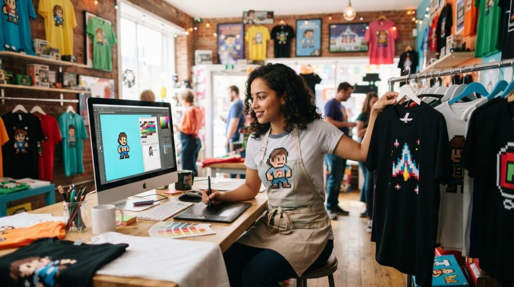
Matching tee color to your 8-bit colorways (2026 “photo-proof” picks)
In 2026, we keep hearing the same customer request: “Will it still look good in pictures?” The answer usually depends on tee color. The wrong background color can kill contrast, even if your 8-bit colorways look great on-screen.
Here are our practical pairings:
- Dark tee + bright palette: best for neon highlights and strong outlines. Your design pops fast.
- Light tee + deeper shadows: great when your pixel art relies on dark values for shape.
- Mid-tone tee + balanced values: works if your palette already has clear lights and darks. Otherwise, it can flatten.
We also suggest thinking about your “negative space.” If the art has large solid background areas, the tee color becomes part of the overall palette. That is why we build colorways to work with the shirt base, not against it.
Concrete examples from 9bitshirts: how our pixel graphics use color
When you want 8-bit colorways that feel like the real thing, you can do what artists do, pick a reference and study how it handles values. Our product pages are a good place to start because the palette is already tested for readability.
If you like retro layouts with clear separation between subject and background, our 8-bit pixelated retro t-shirt is a clean example of a limited color approach. It is the kind of design where highlights and shadows stay consistent, so the pixels never smear together.
If you are into a more character-driven, story-like theme, our sci-fi graphic is another strong reference point for how to keep colorways readable while still feeling dynamic. Start with this as a palette mindset, then adjust your highlight color and outline contrast for your own project:
Quick takeaway from examples: the best 8-bit colorways usually use a small set of colors, reserve the brightest tones for a few key details, and keep shadow tones tight so the silhouette stays obvious.
Common mistakes to avoid with 8-bit colorways (so your design doesn’t look “off”)
Most palette issues come from a few repeat problems. If you fix these, your 8-bit colorways will instantly feel more “pixel art” and less like a vague low-resolution filter.
- Using too many similar midtones: it creates a fuzzy look where pixels do not separate.
- Skipping outline/separators: outlines are not “extra,” they are part of how pixel shapes stay readable.
- Making highlights random: highlights should follow the form, not just be added where there is empty space.
- Choosing colors without checking value: two colors can look different in a palette preview, but the same value can flatten them.
- Ignoring the tee base: your shirt color affects perceived contrast, which changes how your 8-bit colorways feel.
If you keep your values consistent and limit colors per area, your designs will almost always look better, even before any “style tweaking.”
8-bit instruments capture just 256 grey levels, while Landsat 8’s 12-bit sensor reaches 4096.
FAQ
What are 8-bit colorways in pixel art t-shirts?
8-bit colorways are limited palettes designed to look like classic pixel art: clear value steps, strong contrast, and controlled saturation. On t-shirts, that limited approach tends to keep the design readable in real life lighting.
How many colors should I use for 8-bit colorways in 2026?
There is no single magic number, but most good 8-bit colorways limit colors so each shade has a role. As a starting point, plan highlights, midtones, and shadows with only a few options per role.
Do 8-bit colorways need outlines for the design to look right?
Usually, yes. Outlines and separators help pixel shapes stay distinct, especially when the tee fabric and lighting reduce fine tonal detail. Strong outlines are one of the most reliable ways to keep 8-bit colorways crisp.
What tee color works best with bright 8-bit colorways?
In 2026, dark tees are often the easiest match because they make bright highlights and neon-like accents pop. If you use a light tee, make sure your shadow values are deep enough to preserve contrast.
Why do my 8-bit colorways look muddy on fabric?
Mud usually happens when midtones are too similar in value, or when your palette uses colors that do not separate visually at distance. Tight value planning, plus fewer midtones, fixes most muddy-looking 8-bit colorways quickly.
Are existing pixel art tees good references for choosing 8-bit colorways?
Yes, using real product examples can help you see how the palette holds up beyond a screen. We recommend starting with designs like our 8-bit pixelated retro t-shirt and studying where the highlights and shadows land.
Conclusion
In 2026, our best advice for picking 8-bit colorways is simple: build the palette around values first, keep the number of colors tight, and test contrast with real-world viewing distance. When your highlights follow the form and your tee base supports the contrast, your pixel art looks intentional instead of accidental.
Leave a Reply