
If you’ve ever wondered why one graphic tee screams “vintage computer” while another just looks like a random pattern slapped on cotton, it comes down to specifics. The 6 UI elements that actually make shirts feel retro aren’t random nostalgia bait, they’re the exact visual building blocks that made old interfaces feel alive in the first place.
We’ve spent years studying these details at 9bitshirts, and we’re breaking down exactly which ones matter.
Key Takeaways
| UI Element | Why It Reads as Retro | Best Paired With |
|---|---|---|
| Chunky Pixel Sprites | Forces the eye to fill in detail, just like old game consoles | 8-bit and 16-bit gaming tees |
| CRT Scanlines & Static | Mimics the actual texture of an old television screen | Glitch and distortion graphics |
| Neon Grid Horizons | Instant synthwave signal, borrowed straight from arcade cabinets | Synthwave and cyberpunk designs |
| Vaporwave Gradients | Chrome and pastel skies that never actually existed but feel familiar | Vaporwave aesthetic collections |
| Analog Tech Icons | Cassette reels, floppy disks, and dials ground the design in physical nostalgia | Retro tech and cassette graphics |
| Minimalist Command Type | Clean, blocky UI fonts that read like a terminal boot-up screen | Japanese-influenced minimalist designs |
Quick answer: The 6 UI elements that actually make shirts feel retro are chunky pixel sprites, CRT scanlines, neon grid horizons, vaporwave gradients, analog tech icons, and minimalist command-line type. Browse our full retro-themed tee collection to see them all in action, or read more about who we are and why we obsess over this stuff.
Why UI Elements Matter More Than “Retro Colors”
A lot of brands slap a beige gradient on a shirt and call it retro. That’s not it.
The real magic lives in the interface details, the specific pixels, lines, and icons that our brains recognize from actual old-school screens. Remember the satisfying beep-boop of your first power-up? That memory isn’t triggered by a vague color palette, it’s triggered by specific shapes.
That’s why the 6 UI elements that actually make shirts feel retro work as a checklist, not a mood board. Get the elements right and the nostalgia hits automatically.
1. Chunky Pixel Sprites and Grid Blocks
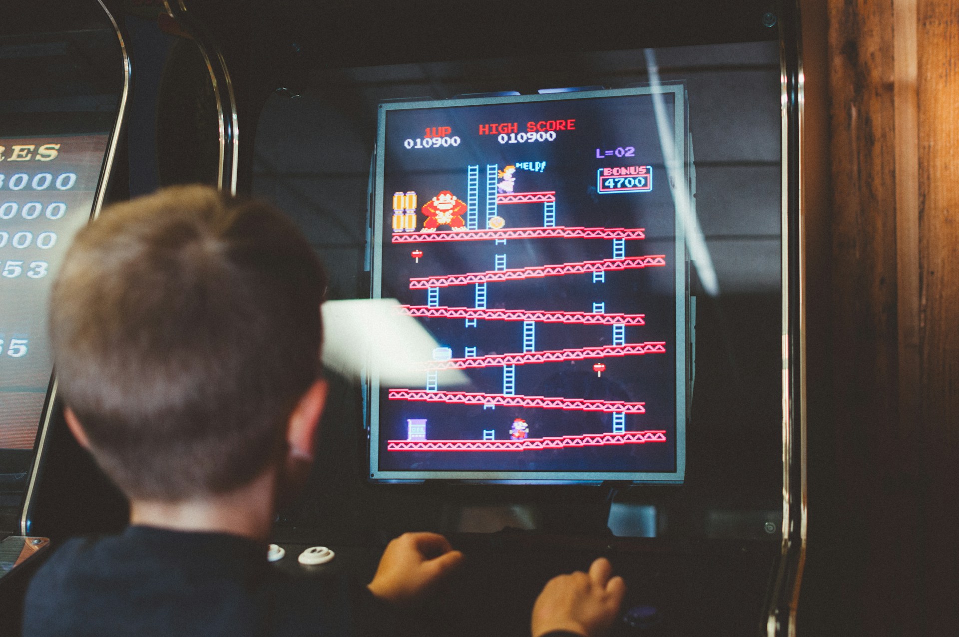
This is the big one. Chunky, blocky sprites made of visible square pixels are the single most recognizable retro UI element there is.
Maybe it’s the way those simple graphics forced our imaginations to fill in the gaps, or how every pixel was placed with deliberate intention. Either way, when a design uses low-resolution sprite work instead of smooth modern vector art, it instantly reads as 8-bit or 16-bit.
This is also the element that ties directly back to gaming’s golden age, the actual renaissance of video gaming, where creativity trumped processing power because processing power simply didn’t exist yet.
2. CRT Scanlines and Digital Distortion
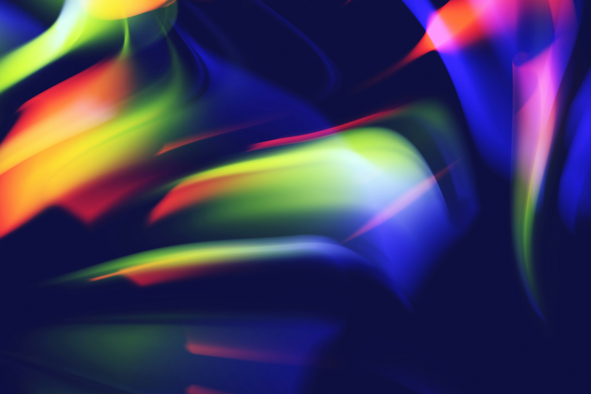
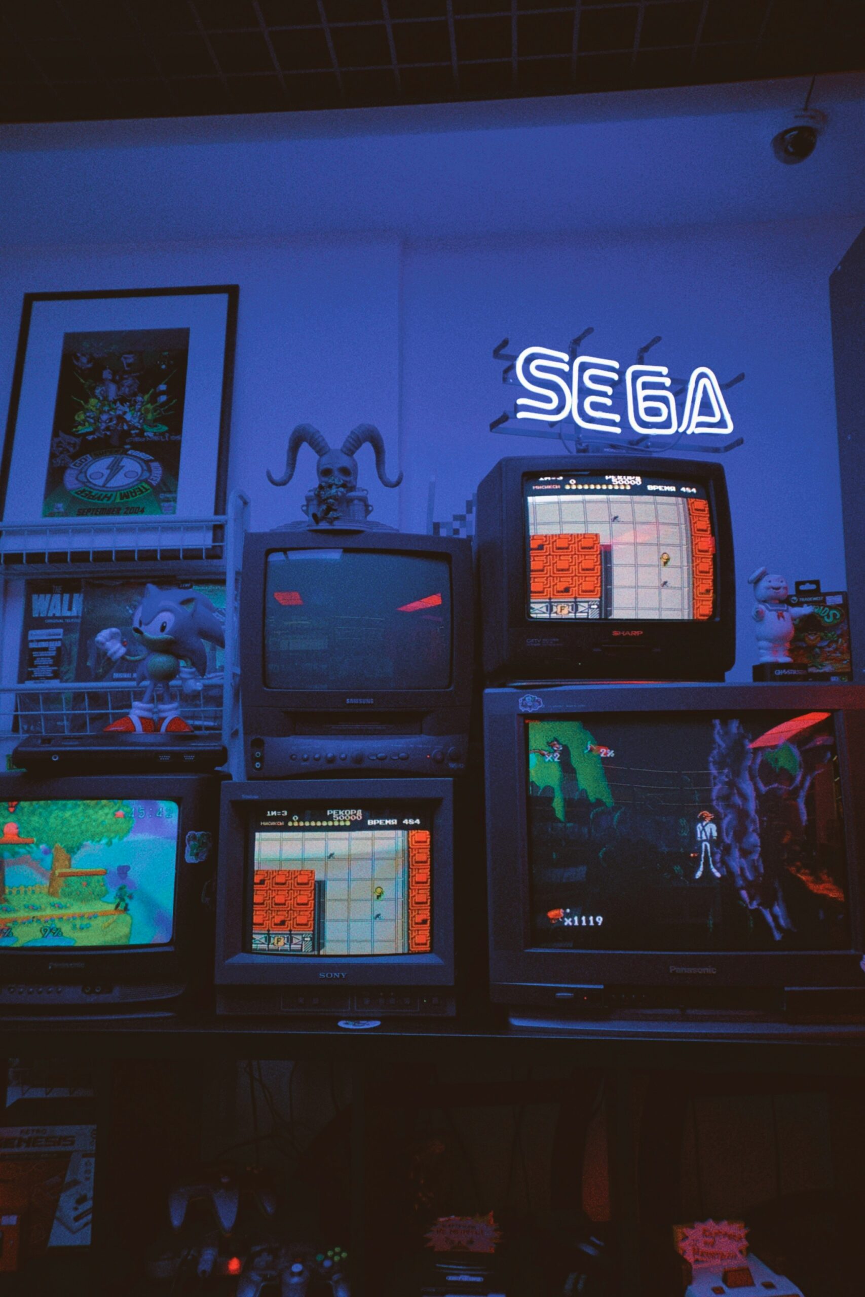
Ever notice how old TV static had that specific horizontal-line texture? That’s a scanline, and it’s the second essential UI element on this list.
Designers now recreate that CRT glitch on purpose, layering thin horizontal bars or slight color-channel splitting over an image. It’s a small detail, but it does a lot of heavy lifting.
Digital distortion as a broader aesthetic trend has exploded because it signals “this came from an old screen” without a single word of text. That hit different back then, and it still does now.
3. Neon Grid Horizons (The Synthwave UI Signal)
Here’s where things get properly neon-soaked. A glowing grid stretching toward a horizon line, usually pink or purple, is basically shorthand for “this is the 80s, but make it futuristic.”
This element comes straight out of old arcade cabinet interfaces and early flight-sim menus, and it’s one of the most recognizable UI elements that actually make shirts feel retro. Pair it with a setting sun or a wireframe mountain range and you’ve got a whole scene, not just a shirt.
These aren’t just colors, they’re emotions wrapped in RGB values.

4. Vaporwave Gradients and Chrome Skies
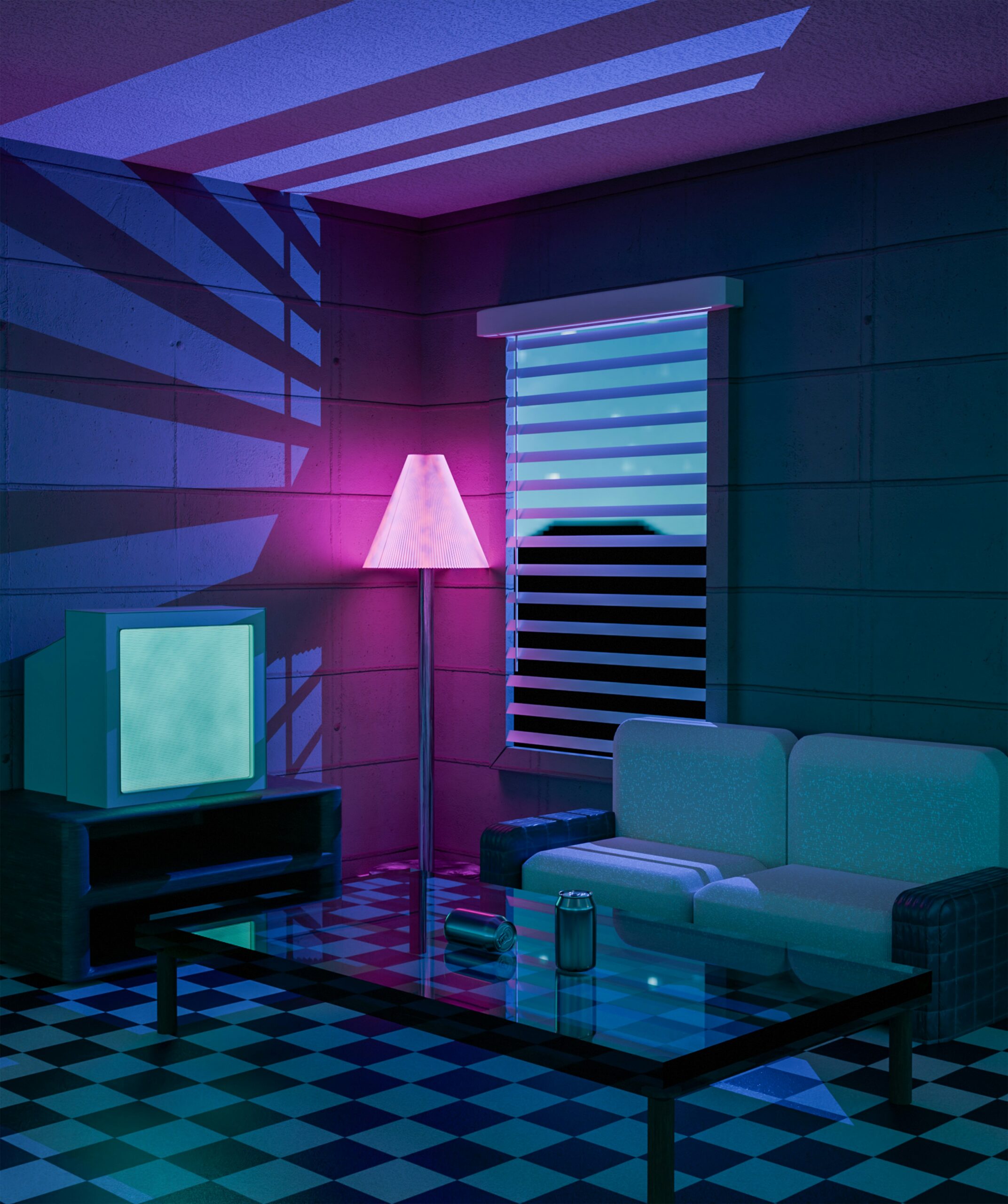
There’s something undeniably magnetic about vaporwave aesthetics that makes you want to dive headfirst into a world of pink sunsets, geometric grids, and chrome palm trees. That gradient, the smooth blend from hot pink to deep purple to teal, is a UI element in its own right.
It’s borrowed from early computer rendering software, the kind that tried to simulate 3D chrome and mostly succeeded in looking like a beautiful digital dream instead. The whole vibe is basically “what if the 80s had Instagram?” and honestly, we’re here for it.
Choosing the right combination of these tones is its own skill, one we cover in detail when talking about vaporwave aesthetic designs and the nostalgic future that never actually happened.
Classic interfaces drive the retro UI shirt trend
5. Analog Tech Icons: Cassettes, Dials, and Buttons
Not every retro UI element lives on a screen. Some of the most effective ones are the physical hardware icons we grew up pressing.
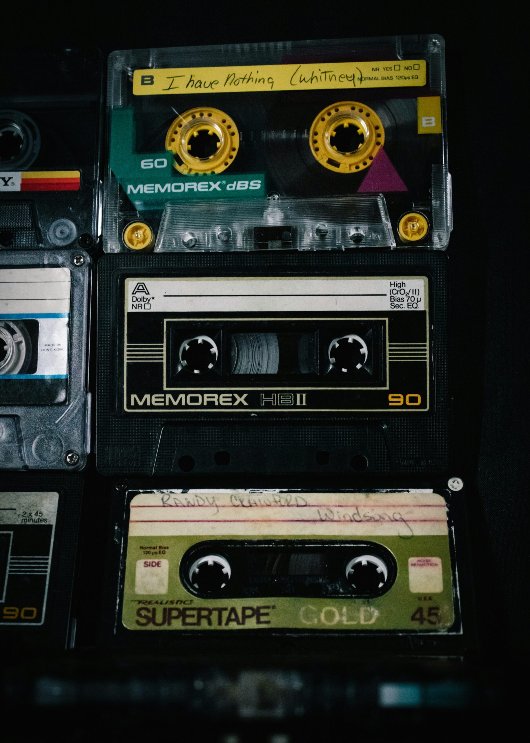
Cassette tape reels, chunky power buttons, dials with little tick marks, these are UI elements too, just analog ones. They ground a design in something tactile, something you can practically hear clicking.
Nostalgia in style often comes down to these small tech graphics more than any color scheme. A cassette icon on a shirt tells a whole story in one small shape.
6. Minimalist Command Prompts and Terminal Type
The last of the 6 UI elements that actually make shirts feel retro is the quiet one: blocky, monospaced type styled like an old command line or boot-up screen.
This element borrows heavily from minimalist design philosophy, the same restraint you see in modern applications of minimalism in Japanese design. Clean lines, careful spacing, and a font that looks like it’s about to print “LOADING…” across your chest.
It’s a quieter kind of retro, but it works because it respects the same rule as every other element on this list: precision over decoration.
How These UI Elements Come Together on One Shirt
Retro gaming isn’t just a hobby, it’s a way of life, and the best shirts prove it by combining more than one of these elements at once. A pixel sprite with a scanline overlay. A neon grid horizon fading into a vaporwave gradient.
9bit is a lone artist making modern, retro-inspired tees that help you stand out from the crowd, and every design pulls from this exact toolkit. It’s less about picking one trend and more about layering the right details until the whole shirt reads as a nostalgic reimagining rather than a costume.
Conclusion
At the end of the day, the 6 UI elements that actually make shirts feel retro aren’t a trend, they’re a language. Chunky pixel sprites, CRT scanlines, neon grid horizons, vaporwave gradients, analog tech icons, and minimalist command type each carry a specific memory, and together they turn a plain tee into wearable art.
Our collection of retro gaming tees isn’t just clothing, it’s wearable art that tells the story of gaming’s most influential era, one UI element at a time.
Frequently Asked Questions
What are the 6 UI elements that actually make shirts feel retro?
The 6 UI elements that actually make shirts feel retro are chunky pixel sprites, CRT scanlines and digital distortion, neon grid horizons, vaporwave gradients, analog tech icons like cassette reels, and minimalist command-line type. Each one pulls from a real piece of retro interface history rather than just a vague color scheme.
Why do pixel graphics feel more retro than smooth modern art?
Chunky pixel sprites feel retro because they force the eye to fill in visual gaps, just like old 8-bit and 16-bit consoles did. That deliberate imprecision is one of the strongest signals in the 6 UI elements that actually make shirts feel retro.
Is vaporwave design still popular in 2026?
Yes, vaporwave gradients and chrome skies remain one of the most requested aesthetics heading into 2026. The pastel-to-chrome color blend is a core part of the 6 UI elements that actually make shirts feel retro, and it hasn’t lost momentum.
What’s the difference between synthwave and vaporwave UI elements?
Synthwave leans on neon grid horizons, wireframe mountains, and glowing sunsets borrowed from arcade cabinet interfaces. Vaporwave focuses more on soft chrome gradients and pastel skies, though both fall under the same umbrella of the 6 UI elements that actually make shirts feel retro.
Can minimalist design actually look retro?
Yes, minimalist command-line type is one of the 6 UI elements that actually make shirts feel retro precisely because it mimics old terminal boot screens. The restraint and monospaced fonts read as vintage tech rather than modern minimalism.
Do CRT scanlines work on all retro shirt designs?
CRT scanlines pair best with pixel sprite work and glitch-style graphics rather than clean vaporwave gradients. When used correctly, they’re one of the most identifiable of the 6 UI elements that actually make shirts feel retro.
Where can I find shirts that actually use these retro UI elements correctly?
Look for brands that treat these details as design fundamentals rather than decoration, since that’s the real test of whether a shirt uses the 6 UI elements that actually make shirts feel retro. Browsing dedicated retro and synthwave collections is usually the fastest way to spot the difference.
Leave a Reply