In 2026, color is still the fastest way to grab attention, and 16% of consumers say the color scheme is the very first thing they notice about a brand. That is exactly why The 5 neon color palettes that actually define vaporwave matter, because this vaporwave aesthetic lives and dies on instant visual hits, from neon grids to chrome palm tree energy.
Key Takeaways
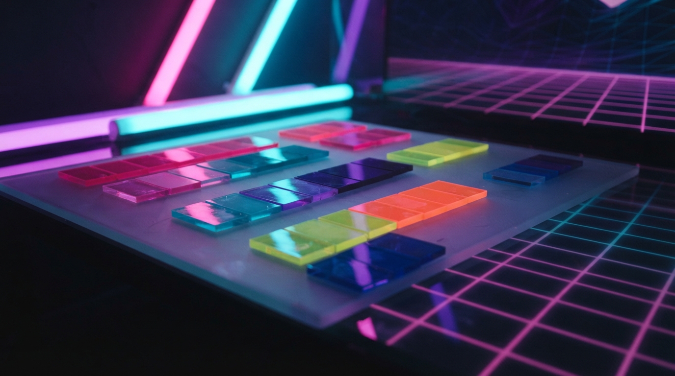
| Palette vibe | What to pair it with | Why it reads as vaporwave |
|---|---|---|
| Cotton-candy pink + electric purple | Sunset backdrops, glossy gradients | Feels dreamy, “80s future” coded |
| Cyan + aqua glow | Neon grids, CRT haze | That clean, sci-fi electric chill |
| Sunset orange + magenta heat | Palm silhouettes, analog glow | Gives the “nostalgic reimagining” warmth |
| Neon mint + soft teal | Geometric shapes, retro UI | Modern freshness inside a retro fever dream |
| Chrome black + vapor highlights | Anywhere you want contrast that pops | Makes the neon vaporwave aesthetic believable |
- Vaporwave style is a visual language, not just a vibe, and the palettes do most of the talking.
- Over the last year of your style experiments in 2026, we keep seeing the same patterns: bright neon accents over soft, washed gradients.
- If you want a structured starting point, our vaporwave aesthetic guide is where we break down what the look is actually doing.
- Want to apply this to your wardrobe? Browse vaporwave aesthetics for design ideas that match these color stories.
- These aren’t just colors. They are emotions wrapped in RGB values, ready for chunky sprites, pixel art, and chiptune energy.
- What is the neon vaporwave aesthetic? It’s a retro-inspired look with neon grids, glossy gradients, and washed sunset color combinations.
- How do I choose The 5 neon color palettes that actually define vaporwave for a design? Pick one “glow” color (pink, purple, cyan, orange, or mint), then add a soft gradient base and a high-contrast dark.
- Do vaporwave style palettes work for t-shirts in 2026? Yes, because bold color separation reads instantly even from a distance, especially on streetwear silhouettes.
Before the colors: what vaporwave is actually “saying”
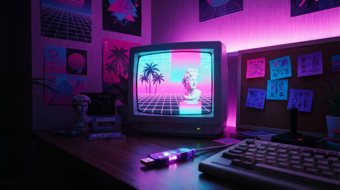
Step into a neon-soaked dreamscape where the 80s never ended and the future looks like a retro fever dream. Remember the satisfying beep-boop of your first power-up? Vaporwave borrows that feeling, then dresses it in neon grids, dreamy haze, and color-forward nostalgia.
So when we talk about The 5 neon color palettes that actually define vaporwave, we are talking about how vaporwave aesthetic designs communicate instantly, even before you read a single word. Think pink sunsets, electric purples, cyan blues, and sunset oranges blended like a digital dream you cannot shake.
If you want the “why,” our take is simple: vaporwave isn’t just an aesthetic rabbit hole. It’s an art movement and music genre that takes 80s and 90s consumer culture and turns the future into something softer, stranger, and glowier.
Palette #1: Cotton-candy pink + electric purple (the “Instagram 80s” glow)
This is the classic vaporwave blend, the one that makes people think of candy gradients and late-night neon windows. It’s the palette that feels like a dreamy wallpaper filter but still holds up when you turn it into vaporwave style graphics.
- Main glow: cotton-candy pink (soft, sweet neon)
- Deep accent: electric purple (adds voltage and contrast)
- Support shades: faded mauves and lighter lilacs (keeps the dreamscape vibe)
In 2026, this combo is still everywhere because it works on both sides of the coin: it can be playful and it can be moody. Pair it with chrome-like highlights or subtle grid lines, and suddenly your design reads like real vaporwave neon aesthetic.
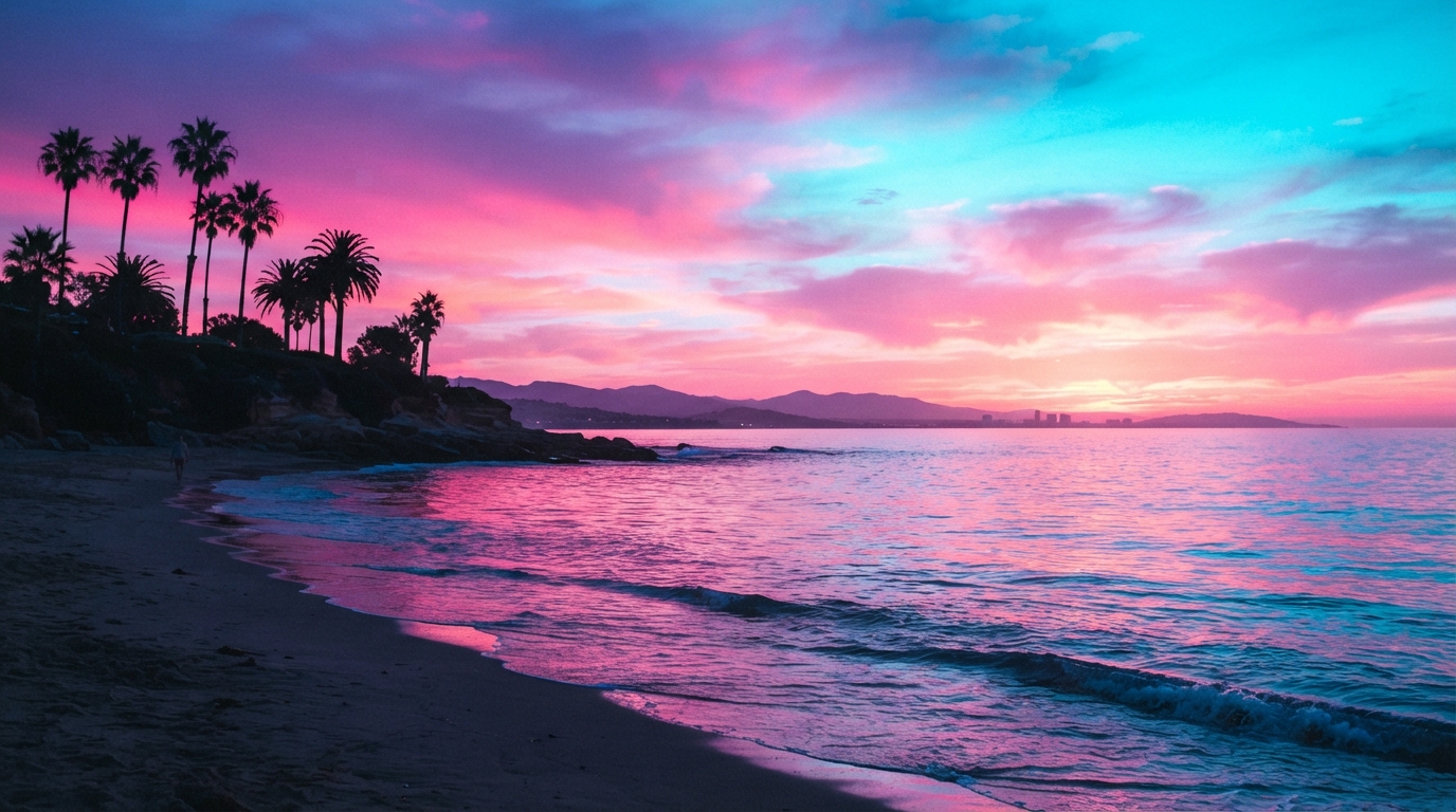
Palette #2: Cyan + aqua blues (CRT chill and neon grid clarity)
Cyan is the “pure signal” color in vaporwave aesthetic. It’s the one that makes neon grids feel crisp, like they are humming under a VHS tape.
- Main glow: cyan (the neon engine)
- Midtones: aqua and soft teal (for the haze)
- Shadow support: deep blue-black (so the glow actually glows)
This palette also plays nice with chiptune-style visual rhythms. If you are into chunky sprites and pixel art, cyan and aqua give you that “digital dream” look without drowning the design in warmth.
Palette #3: Sunset orange + magenta heat (warm neon that still feels nostalgic)
If cyan is the chill, sunset orange is the glow. This palette brings warmth to the vaporwave aesthetic, the kind that makes graphics feel like they were filmed through a sunset scanline.
- Main glow: sunset orange (energy, warmth, magnetism)
- Secondary: magenta (pushes the neon into “vapor” territory)
- Balancing base: soft peach or pale coral (keeps it dreamy, not harsh)
And yes, this is where the “vaporwave neon aesthetic” really starts to feel cinematic. Add a faint grid, a light bloom effect, or a washed gradient overlay, and your design instantly looks like it belongs to The 5 neon color palettes that actually define vaporwave.
Palette #4: Neon mint + soft teal (fresh digital air, modern retro)
Neon mint and soft teal are the palette that makes vaporwave feel updated without losing the timeless feel. It’s the “clean neon” version of the dreamscape, and it works especially well for geometric shapes and retro UI vibes.
- Main glow: neon mint (bright, confident highlight)
- Support: soft teal and faded turquoise (smooth the edges)
- Contrast: dark indigo or near-black (lets mint pop)
We like this palette when the design also needs a little restraint. Too much pink and purple can feel heavy, but mint and teal give your vapor aesthetic breathing room, like you just stepped out of the neon grid for a second.
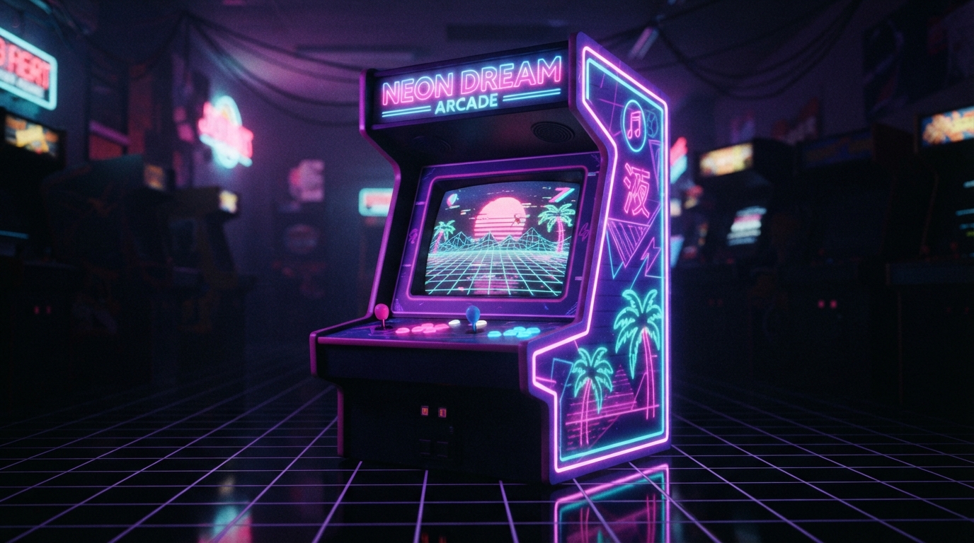
Palette #5: Chrome black + vapor highlights (contrast that makes everything readable)
This one is easy to overlook because it sounds simple, but it’s the foundation of the whole look. Chrome black, near-black shadows, and vapor highlights are the contrast engine that makes neon colors actually read as neon.
- Base: chrome black (or deep charcoal) to anchor the glow
- Highlights: bright pink, cyan, or orange, used sparingly
- Midtone: smoky gray-blue (adds that VHS haze)
These aren’t just colors. They’re emotions wrapped in RGB values. If you want your vaporwave style to feel intentional, use chrome black to keep the rest of The 5 neon color palettes that actually define vaporwave from bleeding into each other.
Remember the satisfying beep-boop of your first power-up? Chrome black is like the moment the screen locks in, contrast clicks, and the whole scene becomes legible.
How to use these 5 vaporwave neon color palettes (without overdoing it)
Here’s our practical approach, the one we use when we are building designs that feel like they belong in the same aesthetic universe. Keep it simple, let the palette do the work.
- Pick one hero palette from The 5 neon color palettes that actually define vaporwave.
- Choose a supporting wash (soft gradient, haze, or faded midtones).
- Use chrome black for contrast so grids, text, and chunky sprite edges stay sharp.
- Limit neon highlights to small areas (borders, points of light, skyline edges).
- Test at distance, because vaporwave style is all about instant read.
And if you want a structured starting point for color work, our vaporwave aesthetic designs guide also walks through how the look connects to that nostalgic reimagining of what the future was supposed to be.
We also build around the idea that the 1980s and 1990s weren’t just decades. They were the Renaissance of video gaming. That matters because the best vaporwave visuals still feel like they were made by someone with a respect for pixels, textures, and visual rhythm.
Want to turn these palettes into wearable art in 2026?
Our collection is about the same thing the palettes are about, nostalgia with attitude. The whole vibe is basically “what if the 80s had Instagram?” and honestly, we’re here for it.
We like to think our retro-inspired tees are more than just clothing, they are wearable art that tells the story of gaming’s most influential era. And since vaporwave neon aesthetic depends on fast visual impact, shirts are a perfect canvas.
- Explore more vaporwave-ready ideas in vaporwave aesthetics.
- If you want that sleek neon energy with a gaming angle, check out video games.
One small note for color nerds, if you are trying to match the right “glow,” use fewer colors with stronger separation. More than just 8-bit is how we look at it, because vaporwave works when it blends pixel precision with that dreamy, neon-soaked dreamscape feeling.
Conclusion: your next vaporwave palette is already there
The magic of The 5 neon color palettes that actually define vaporwave is that they are instantly recognizable, but still flexible enough to fit your own aesthetic rabbit hole. When you pair cotton-candy pink and electric purple with cyan grid clarity, sunset orange warmth, neon mint freshness, and chrome black contrast, your design basically does the heavy lifting for you.
In 2026, the vaporwave neon aesthetic is not slowing down. It keeps getting reinterpreted through new formats, new styles, and new ways of wearing nostalgia. And if you want that look to hit like it should, remember this, pick one hero palette, use supportive haze, and let chrome contrast keep everything readable.
Frequently Asked Questions
What are The 5 neon color palettes that actually define vaporwave?
The 5 neon color palettes that actually define vaporwave usually center on cotton-candy pink plus electric purple, cyan plus aqua blues, sunset orange plus magenta heat, neon mint plus soft teal, and chrome black with vapor highlights. These combos create the glow, haze, and contrast that make the vaporwave aesthetic feel instantly recognizable.
How do I create a vaporwave aesthetic palette in 2026 without it looking messy?
Pick one hero palette, then limit neon highlights to edges, text, and small “light sources.” Use a soft gradient wash for the background and chrome black (deep charcoal) for contrast, so your vaporwave style stays crisp instead of blending into a blur.
What colors make the neon vaporwave aesthetic look the most authentic?
Authentic-looking neon vaporwave aesthetic comes from vivid pinks, electric purples, cyan glows, and sunset oranges, grounded with deep blacks or smoky grays. When the contrast is strong, the neon reads like real vapor, not just decoration.
Can these vaporwave style palettes work for t-shirt designs in 2026?
Yes. In 2026, vaporwave style graphics benefit from bold separation because they stay legible at a distance, especially on streetwear. These palettes also translate well to wearable art when you keep the hero colors dominant and use chrome black for outlines.
What’s the difference between vaporwave and synthwave color palettes?
Both can be neon-soaked and retro, but vaporwave often leans more into dreamy, washed gradients and candy-like sunset tones. Synthwave typically feels more structured and sleek, with its neon emphasis often showing up as cleaner lines and more controlled spacing.
Should I use hex codes or choose colors by eye for vaporwave?
For consistency, using hex codes helps a lot, especially if you are building a set of designs that should look like they belong together. If you are starting fresh, choose by eye first, then lock in the exact shades that match your favorite vaporwave neon aesthetic results.
Leave a Reply