
Here’s a stat that should make every graphic tee shopper pause: 70% of print failures at production scale trace directly back to the artwork file itself, not the printer, not the fabric, the file. So if you’ve ever wondered how to spot pixel-perfect rendering on direct-to-garment prints before you drop cash on a shirt, you’re asking the right question at the right time, because in 2026 the difference between a crisp chunky sprite and a blurry mess usually comes down to details most shoppers never think to check.
We’ve spent years obsessing over this exact thing. Every 8-bit worlds design we print lives or dies by pixel-perfect rendering, so we’ve learned to spot the good, the bad, and the “why does this look like it melted in the wash” ugly.
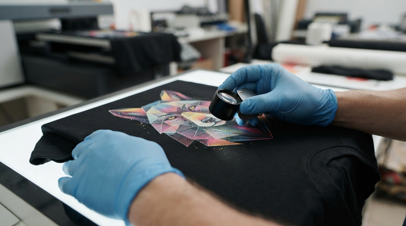
Key Takeaways
| What to Check | Why It Matters |
|---|---|
| Pixel dimensions of the source file | Low-res art gets blurry the second it’s stretched onto a shirt |
| Edge sharpness under close inspection | Pixel-perfect prints hold crisp square edges, not soft fuzzy ones |
| Color saturation and bleed | Muddy colors usually mean the ink didn’t sit right on the fabric |
| Integer scaling (200%, 400%, etc.) | Whole-number scaling keeps pixel art crisp instead of warped |
| Fabric weave and weight | Cotton content affects how ink soaks in and how sharp the final print looks |
| Print speed and cure time | Rushed curing can leave prints cracking or fading fast |
| File size and format | Properly prepped files under 50 mb keep quality consistent from screen to shirt |
Want to see pixel-perfect rendering done right? Browse our retro graphic tees collection where every chunky sprite is printed with the resolution it deserves.
What “Pixel-Perfect” Actually Means on a Graphic Tee
Pixel-perfect doesn’t just mean “looks nice.” It means every single pixel in the original artwork lands exactly where it’s supposed to on the fabric, with no smudging, no stretching, and no accidental blur turning a clean 16-bit character into mush.
Remember the satisfying beep-boop of your first power-up? That crispness came from deliberate pixel placement, and honestly, a good direct-to-garment print should honor that same precision.
The 1980s and 1990s weren’t just decades, they were the Renaissance of video gaming, where creativity trumped processing power and every pixel was placed with intention. A pixel-perfect DTG print respects that legacy instead of flattening it into a blurry approximation.
How to Spot Pixel-Perfect Rendering Before You Even See the Shirt
The easiest way to check for pixel-perfect rendering on direct-to-garment prints happens before printing even starts, right at the file resolution stage.
Here’s what we look for on every design headed for print:
- 300 DPI minimum for the print area, no exceptions
- Pixel dimensions that match the print size, roughly 3600 by 4800 pixels for a standard 12 by 16 inch print zone
- No visible compression artifacts when zoomed to 100%
- Clean vector or high-res raster source files, never a stretched thumbnail
If a shop can’t tell you the resolution of their print files, that’s a red flag. A pixel-perfect graphic shirt starts life as a pixel-perfect file.
Spotting flawless direct-to-garment rendering starts with the source file. Below this threshold, prints risk visible blurring and pixelation.
Look Closely at the Edges: Where Pixel Art Prints Go Wrong
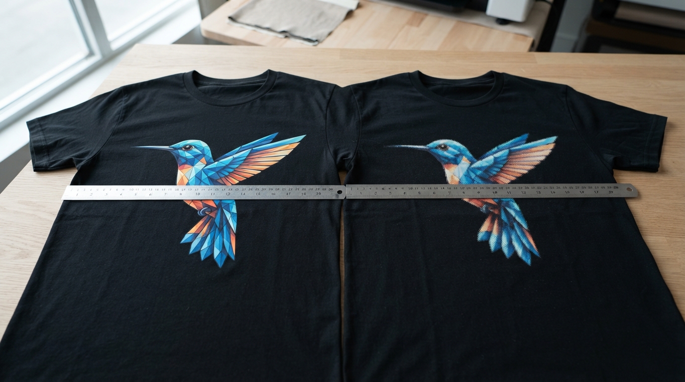
Grab any graphic tee and zoom in on the edges of the design. This is the single fastest way to spot pixel-perfect rendering on direct-to-garment prints in real life, no lab equipment needed.
On a genuinely pixel-perfect print, the squares stay square. The corners stay crisp.
On a bad print, edges turn soft and fuzzy, like someone smudged a thumb across wet paint. That fuzziness usually means the file was upscaled sloppily, or the DTG printer’s droplets weren’t calibrated to hit those tight boundaries cleanly.
We check this on every single design before it ever touches a shirt. It’s part of what makes a chunky sprite actually look chunky instead of accidentally chunky in the wrong way.
Color Bleed, Ink Saturation, and What Fabric Has to Do With It
Pixel-perfect rendering isn’t only about sharp edges, it’s also about color staying exactly where it belongs.
Cotton content actually plays a bigger role here than most people realize. Cotton substrates make up roughly 49.20% of the DTG market right now, and that weave affects how deeply ink soaks in versus sitting crisp on the surface.
A tight cotton weave holds color boundaries tighter, which is exactly what neon grids and vaporwave gradients need to look clean instead of muddy. Pigment inks, which now account for over 60% of DTG ink formulations, help here too, giving that high-chroma pop without needing a screen printing setup at all.
If you’re eyeing a design from our vaporwave aesthetics line, this is exactly why the pink sunsets and chrome palm trees stay vivid instead of bleeding into a pastel blob.
Integer Scaling: The Secret Behind Sharp Retro Graphic Tees
Here’s a technical detail most shoppers never hear about, but it’s a huge tell for how to spot pixel-perfect rendering on direct-to-garment prints.
When pixel art gets enlarged for printing, it has to scale by exact whole numbers, think 200%, 400%, 800%, or 1600%, never something messy like 137%. This is called integer scaling, and it’s the difference between a crisp 8-bit character and one with weird warped edges that make the whole design look off.
Skip this step and you get distortion nobody asked for. Nail it and every square pixel stays a perfect square, no matter how big the print gets.
It’s a small technical thing, but it’s exactly the kind of detail that separates wearable art from a random print job.
Vintage Graphic Tees vs. Modern DTG: What Actually Changed
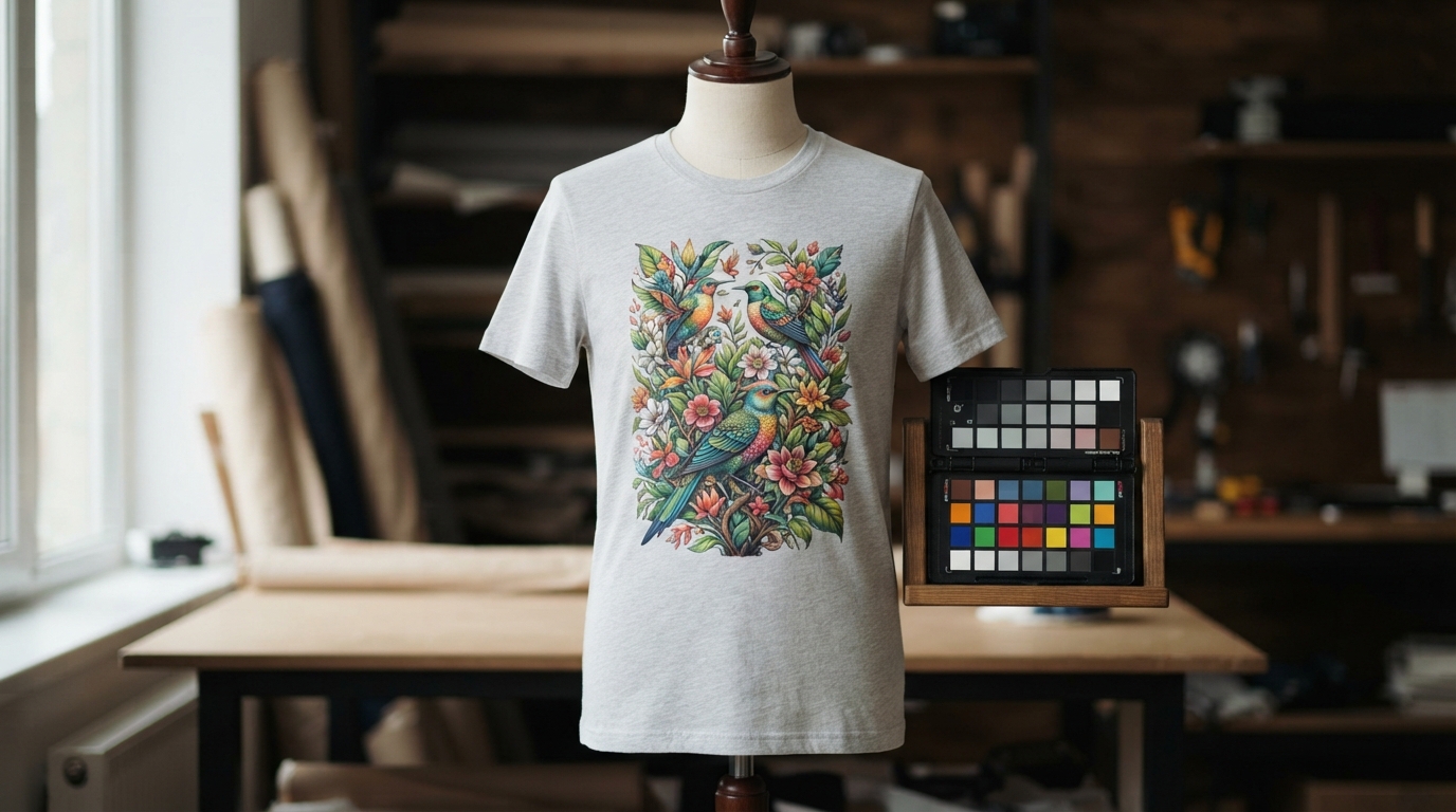
Vintage graphic tees used to rely almost entirely on screen printing, which meant setup costs around USD 50 to 200 per color. That made complex, multi-color pixel art designs expensive or flat-out impossible for small runs.
Direct-to-garment changed that math completely. Now a design with a hundred different colors costs the same to print as one with three, which is exactly why retro graphic t shirts with dense, detailed pixel art have become so much more common on the market.
The catch? DTG only looks good when the file behind it is pixel-perfect. Otherwise you’re just paying more for the same blurry mistake, printed in more colors.
Where to Actually See Pixel-Perfect Rendering Done Right
Talk is cheap, so here’s where we’d point you to actually see this stuff in action.
Our synthwave collection leans hard into gradient-heavy neon palettes, which are brutal to print well if the rendering isn’t dialed in. Any softness in those gradients shows up instantly.
Our video game tees lean the other direction, chunky sprites and hard pixel edges that expose blur immediately if the DPI wasn’t right. Both extremes are useful tests, honestly, because they stress-test rendering quality in completely different ways.
Even our Japanese aesthetic designs and travel-inspired graphic tees get run through the same pixel-perfect checklist, because a blurry print is a blurry print no matter the theme.
Red Flags That Mean a Graphic Shirt Won’t Hold Up
Beyond the print itself, a few practical warning signs tell you a shop isn’t taking pixel-perfect rendering seriously.
- Vague or missing file size limits (quality prep usually caps uploads around 50 mb to keep resolution intact)
- No mention of DPI or resolution requirements anywhere on the site
- Print times that seem suspiciously fast (proper DTG runs about 60 to 90 seconds per shirt, rushing it usually means rushing quality too)
- No info on cure time (ink needs roughly 90 seconds under heat press at the right temperature to actually bond to the fibers)
Why We Obsess Over Pixel-Perfect Rendering
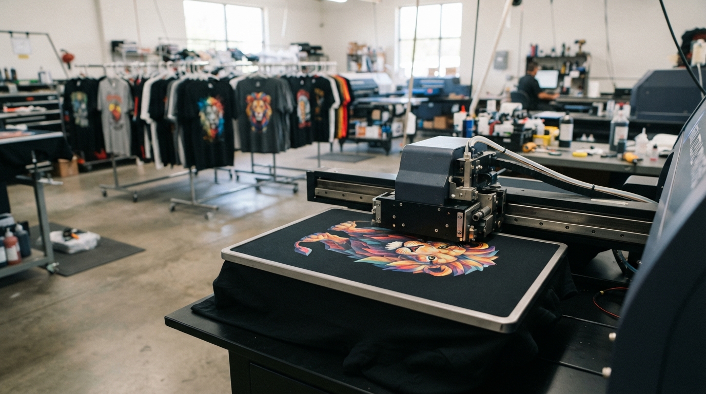
9bit is a lone artist making modern, retro-inspired tees that help you stand out from the crowd, and pixel-perfect rendering isn’t a nice-to-have around here, it’s the whole point.
When you’re working with 8-bit worlds and chunky sprite characters, there’s zero room for blur. A soft edge on a pixel art mushroom or a muddy gradient on a synthwave sunset isn’t just a minor flaw, it kills the entire aesthetic.
Our collection of retro gaming tees isn’t just clothing, it’s wearable art that tells the story of gaming’s most influential era, and that story deserves to render properly on fabric, not dissolve into a blurry approximation of itself. Check out the full lineup on our homepage to see the full range of designs we’ve put through this exact process.
Conclusion
Learning how to spot pixel-perfect rendering on direct-to-garment prints really comes down to a handful of checks: resolution, edge sharpness, integer scaling, color saturation, and fabric weave. None of it is complicated once you know what to look for, and honestly, once you start noticing it, you can’t unsee it on every graphic tee you scroll past.
Whether you’re shopping vintage graphic tees, hunting for the perfect black graphic tees for your rotation, or just trying to figure out why one shirt looks crisp and another looks like a smudged screenshot, the answer is almost always in the file and the print process behind it. Pixel-perfect rendering isn’t magic, it’s math, ink chemistry, and someone actually caring enough to check the details before hitting print.
Frequently Asked Questions
How can I tell if a direct-to-garment print is pixel-perfect before buying?
Zoom in on product photos and check if the edges of the design stay sharp and square instead of fuzzy. A shop that mentions DPI, resolution, or file prep standards is also a strong sign they take pixel-perfect rendering on direct-to-garment prints seriously.
What resolution is needed for a pixel-perfect DTG print in 2026?
Most quality DTG prints need a minimum of 300 DPI, which translates to roughly 3600 by 4800 pixels for a standard 12 by 16 inch print area. Anything lower risks visible blurring once the design gets enlarged onto the shirt.
Why do some graphic tees look blurry even though the design looked fine online?
This usually happens when the source file gets stretched using non-whole-number scaling instead of proper integer scaling like 200% or 400%. It’s one of the most common causes of blur in pixel art specifically, since irregular scaling warps the clean square edges.
Is DTG printing better than screen printing for detailed pixel art designs?
For complex, multi-color pixel art, yes, DTG is usually the better and more affordable choice since screen printing setup fees run 50 to 200 dollars per color. DTG handles high color counts without extra setup costs, which is exactly why detailed retro graphic t shirts have become more common in recent years.
Does fabric type affect how sharp a DTG print looks?
Yes, cotton content and weave tightness affect how ink sits on the fabric versus soaking in unevenly. Tighter cotton weaves generally hold pixel-perfect edges and color boundaries better than looser or blended fabrics.
What file size should I use when uploading custom pixel art for DTG printing?
Most print systems cap uploads around 50 mb to balance quality with compatibility. Staying under that limit while keeping resolution high (300 DPI or better) gives you the best shot at pixel-perfect rendering on direct-to-garment prints.
Is pixel-perfect DTG printing worth paying more for in 2026?
Yes, especially for retro, vintage, and gaming-inspired graphic tees where the whole appeal lives in the crispness of the pixel art. A blurry print undermines the entire design, so paying a bit more for proper pixel-perfect rendering is almost always worth it for designs meant to last in your closet.
Leave a Reply